Predicting a $BBCA Bounce Late in Q3 2026
July 22, 2026 · 04:18 UTC
Drawing a few lines on a BBCA chart in April turned into a call the market answered three months later, right at the last floor.
Note
This note walks through the price map, the reasoning behind each level, and the July reaction that matched it. The timing model stays private, so the focus here is the level logic anyone can track, with both source posts linked below for the record.
Mapping the Price Levels
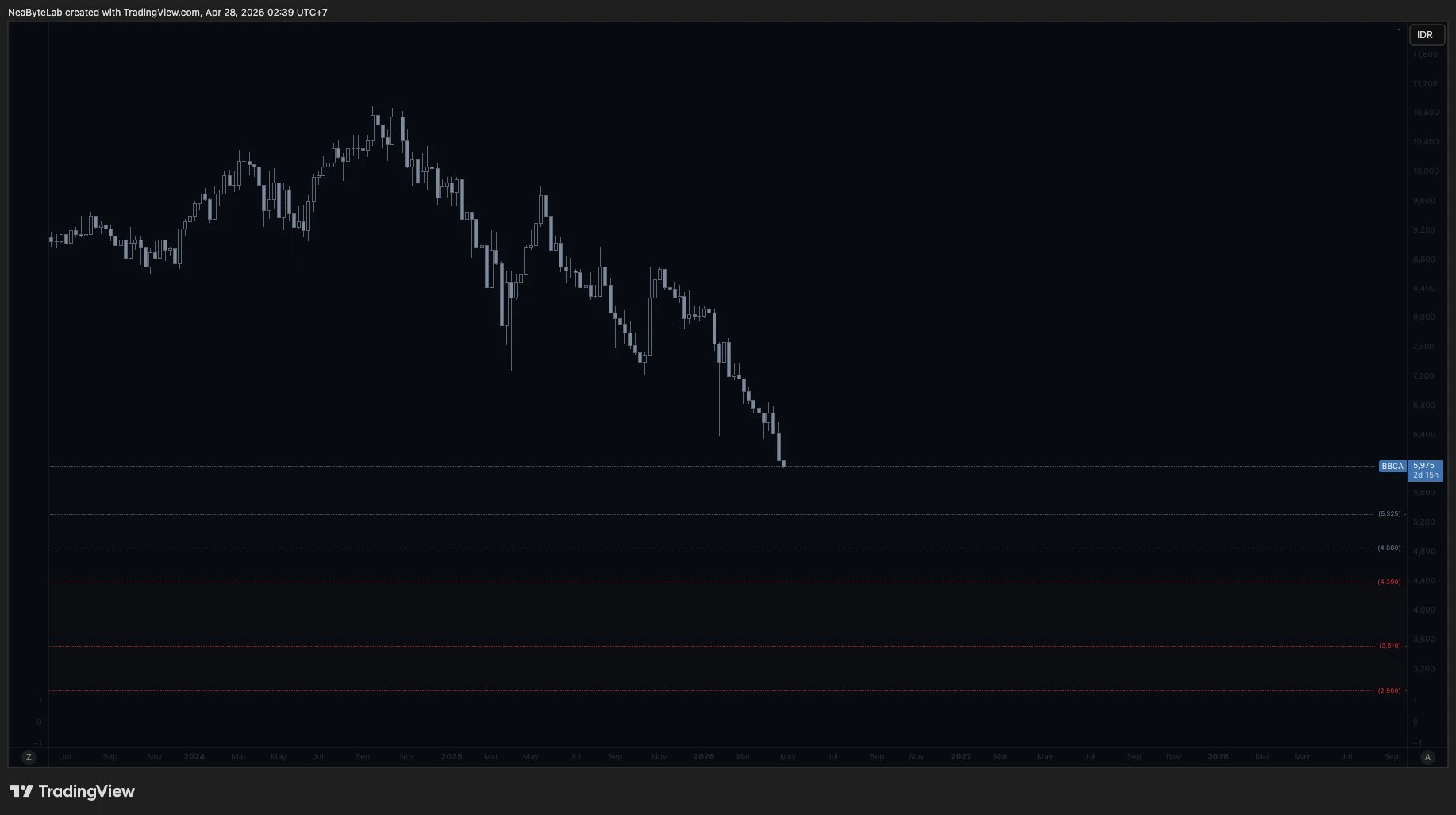
Everything started on April 28, 2026, when a chart split BBCA into two kinds of zones with plain color coding. Grey and white lines at Rp5,325 and Rp4,860 marked where a rebound looked likely, while red lines at Rp4,390, Rp3,510, and Rp2,900 marked deep discount or an extreme correction if price ever broke lower into that band without first holding the white floor above.
That lower white line at Rp4,860 carried the most weight of them all here. It sat as the last rebound zone right before the red band, so a hold there signaled real strength while a break below it meant the deeper correction case was now in play.
Reading the Rebound Timing
A quantitative model added the missing piece, a timing estimate that pointed toward a rebound landing somewhere inside Q3 2026.
Timing came from watching how price behaved near each zone across the prior months, never from a single indicator firing once in isolation. The estimate stayed a range rather than one fixed day, so late Q3 became the window worth watching closely.
Confirming the July Reaction
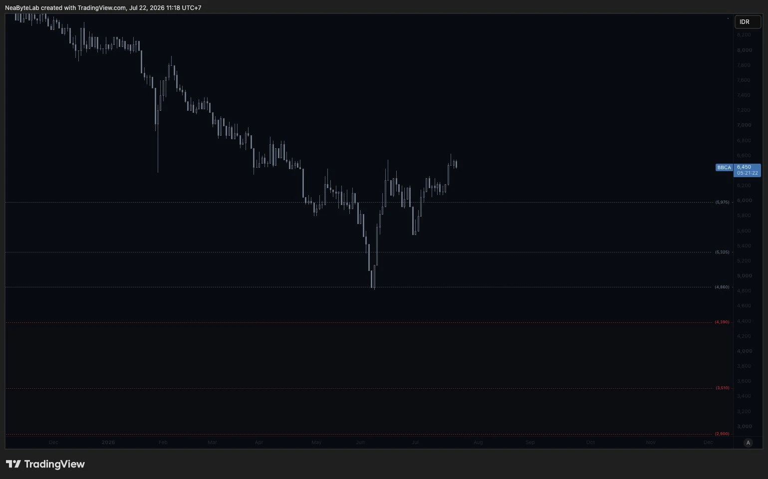
Price answered on July 22, 2026, and it answered fast. BBCA dropped toward that lower white line at Rp4,860, reacted right at the edge, then pushed back up with a sharp rebound. Price never touched or broke the red zone sitting underneath it once.
Both the level and the window held here. The white line acted as the floor it was drawn to be, and the bounce arrived inside Q3.
Checking the Level Logic
Anyone can follow the core check by eye, with no model at all. The rule stays plain, since a daily close that holds above Rp4,860 keeps price in the rebound case, while a close below it flips the read into the correction case toward the red band.
Reading it stays that simple on any chart out there. Mark the two white lines as rebound zones, mark the three red lines below as discount and correction zones, then track which side of Rp4,860 each daily close lands on over time. The timing part is the private piece and stays out of view, yet the level part is fully open for anyone to draw and watch on their own.
Comparing the Common Approaches
Static support and resistance draws the same kind of lines, yet it stops at price and never says when a reaction is due. The map here shares that level logic but pairs it with a timing estimate, so the call carries a date instead of an open zone.
Indicator crossovers like a moving average or an RSI reading react only after price has already moved, which makes them followers rather than real forecasts by design. The zone plus timing approach instead commits to a level and a window ahead of the move, then gets graded honestly against what price actually does once the date and the level both finally show up.
Pure machine learning price prediction leans on a black box that returns one number without a reason a reader can inspect. The value here is the opposite, since every level stays visible on the chart and the timing is a stated window worth checking.
Grading One Clean Hit
One clean hit proves a direction, never a certainty. The level held and the timing matched, yet a single hit is one data point.
Ahead, the model reads more good news coming toward new highs, and the same white lines now flip into a base worth watching on the way up. Whatever comes next stays public on both posts above, so the reaction can be checked against the map later.